How to Make Your WordPress Theme Responsive
The habits of internet users are always evolving. Back in the 1990’s, we were all using the internet using desktop computers and 14″ monitors. CRT Monitors were later replaced by slimmer alternatives, and we then all started accessing the internet while on the move.
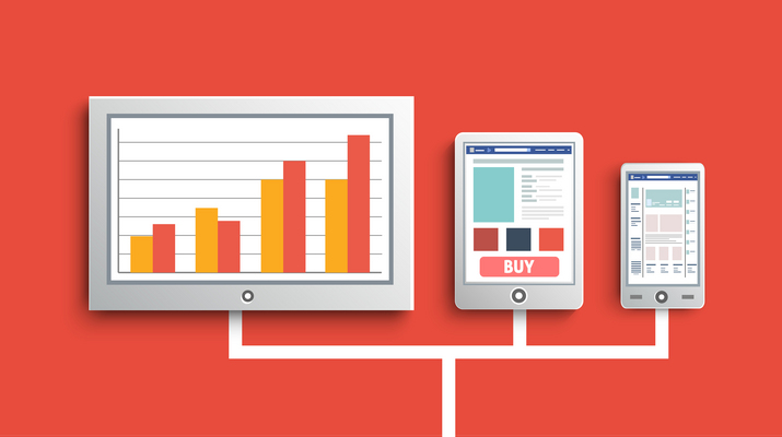
Today, people access the internet in a wide variety of ways. At their computer desk, on their smartphone, on their tablet, on their television, on their gaming device, etc. The list goes on and on. As website owners, it is important for us to give all visitors a great user experience.
Last September, SuperMonitoring published an interesting infographic on the state of mobile 2013. It noted a lot of interesting statistics, such as:
- 1.2 billion people access the internet from their mobile devices
- Users spend 1.8 hours a day, on average, using their mobile phone
- 80% of mobile users use their phone while watching television
- 41% have used their phone to browse for a product after seeing an advertisement for it on television
- 50% of mobile users use their phone as their primary means of accessing the internet
These figures stress the importance of making your website mobile friendly. It is clear that mobile visitors should not be considered as an afterthought anymore.
In general, most website designs look as good on tablets and iPads as they do on desktop computers and laptops. Unfortunately, designs do not always look so good on mobile phones and smaller devices. Even some WordPress news themes struggle to give visitors a good user experience.
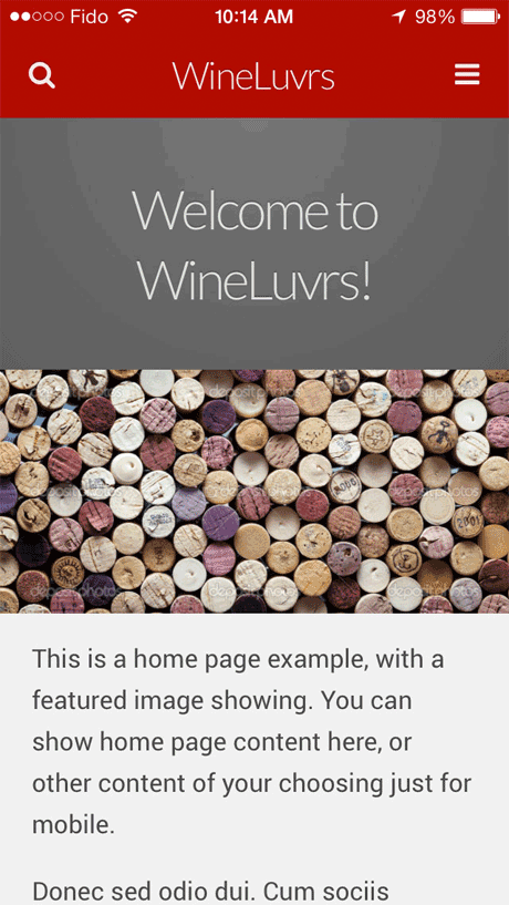
Make Your Website Mobile Friendly with WPTouch
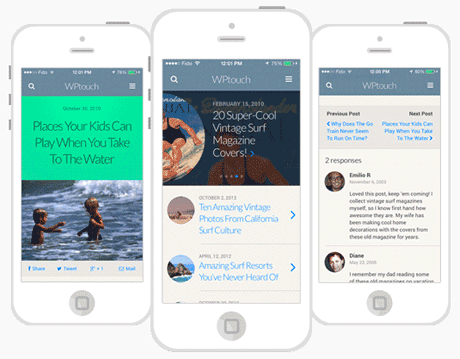
One way to resolve this issue is to display a different design to mobile users. A great solution for doing this is the WordPress plugin WPtouch. Once activated, WPtouch will display a beautiful mobile design to those who visit your website on a mobile device.
The plugin allows you to change the title that is displayed to mobile visitors. Custom code, such as stats tracking, can be added for mobile visitors through the admin area.
The plugin also lets you disable specific shortcodes that might cause your content to display incorrectly on a mobile device.
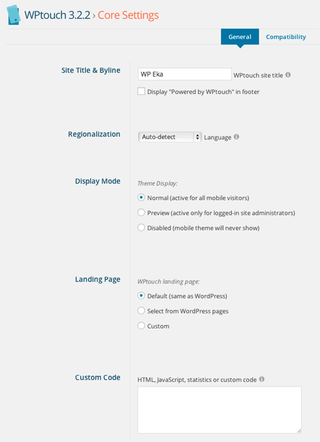
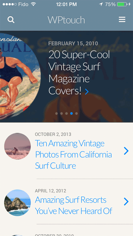
WPTouch lets you customise every aspect of your mobile design. You can change the number of posts listed, what meta information is displayed, and whether a beautiful slider is shown.
Your mobile theme skin can be modified from the admin area. You can change colors, your logo, the footer, fonts, and more. You can also upload custom icons for Android and iOS users.
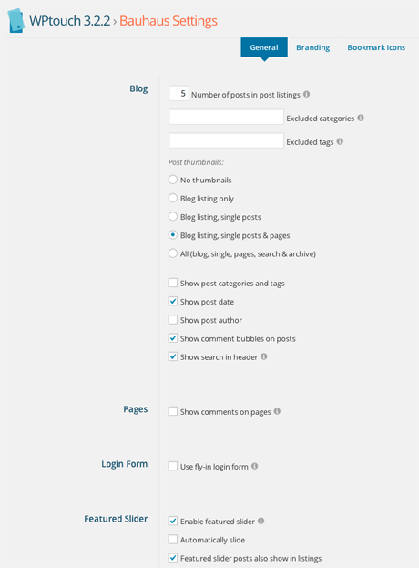
The free version of the plugin comes with one design (called Bauhaus). It is a clean, professional looking design that has a beautiful interface.
While many responsive WordPress themes squeeze content into a small area, WPTouch displays a list of posts in a clear, easy to read interface. Browsing your website using the theme feels like you are using a dedicated app, rather than a mobile theme skin.
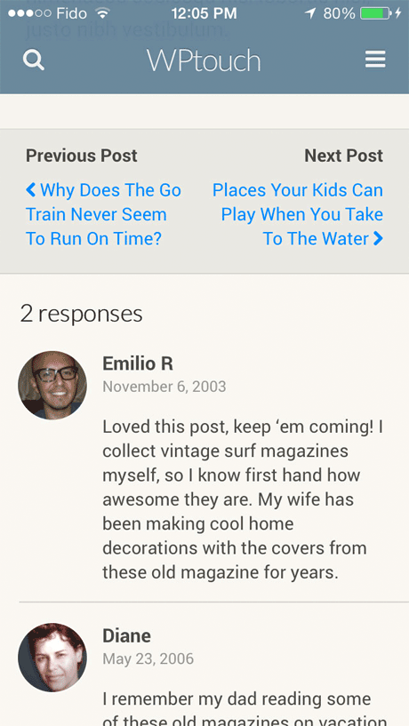
Visitors can do everything on your website that they would normally do such as search for posts and publish comments. The plugin also supports custom post types and taxonomies.
WPTouch can be downloaded free from WordPress.org. A premium version of the plugin is available that comes with four additional themes. It also features a caching extension that makes your pages load five times quicker, responsive images support, and customized mobile content.
WPTouch Pro is available from $49 and comes with one and one ticketing support.
I recommend checking WPTouch out if you are looking for a fast, stylish, responsive design for mobile visitors. You will not be disappointed.
Kevin
Leave a Reply