How Using Skeleton Screens Can Help Enhance UX

We have all been on a site and clicked on something only to have nothing happen. Out of frustration, we click again or reverse our action and try something else. This is a clear sign of a site with UX issues.
Obviously, when you click on something, work is being done. Data is being sent back and forth behind the scenes, but nothing is popping up on your computer. The issue may be because it is a large download, or the server might be overloaded. That is not your concern.
All you know is it appears as if nothing is happening and that is upsetting.
This is where having skeleton screens can help to alleviate the perception of inactivity. You will retain traffic on your site, and may even reduce bounce rates if you just give the people visiting the site something to see while the page comes up completely.
Meeting perceptions about status
The average person takes between 100 and 140 milliseconds to find a focus point on a screen, according to SitePoint.
This means that you have about one second to give people something to look at if you want to appear as if the screen is coming up instantly. Since most people expect that in our current technological climate that everything will be instant, it is important that you are meeting these demands.
Without it, your site is going to appear to be out of date. Even worse if your site takes longer than 10 seconds to appear on the screen, people will lose interest altogether and go to another site.
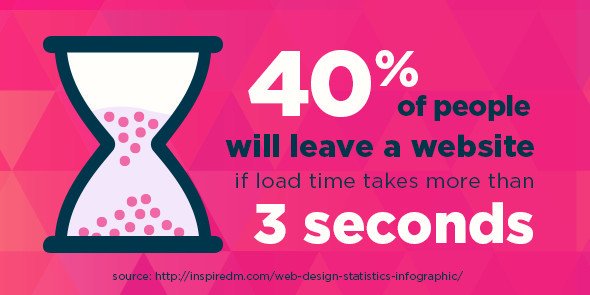
You don’t want to lose that traffic, do you? No one does.
This is why meeting the perceptions are so very important and enhancing the user experience (UX) through skeleton screens can help to accomplish this goal.
Something is better than nothing
When you have a site that is taking a while to load, you need to provide your visitors with something they can see. Give them an indication that SOMETHING is happening. This has been done by many applications and websites with the use of things like:
- Status bars – to show the progress
- Spinners – that give the indication that progress is being made
- Static photos or marketing – to appease the senses while the work is being done
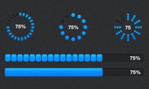
All of these methods accomplish the same goal. They let people know that something is happening, or at least distract people from the fact they cannot actually see the progress.
Some browsers help you out by displaying at the bottom of the screen what they are doing while they are doing it. Letting you know they are contacting the host and downloading the files. Still, this is not coming from your site and makes it appear as if your site is just slow. You need something that will show your visitors that you are working on getting everything on to their screen as quickly as possible.
What is a skeleton screen?
Much like when you build a house, there is a basic outline for every website. You know the location of everything, from graphics and subject matter and so much more before any of the actual work is done. This allows you to decide how your website is going to look before you go through the process of making it.
Here’s a screenshot of the WordPress app showing skeleton screen:
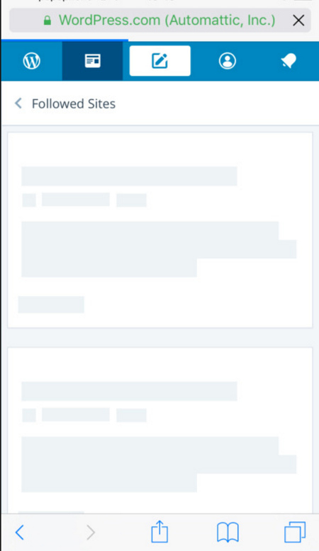
A skeleton screen is something very similar to this. It will show your visitors what they can expect and where they can expect it. It does not give the exact information that is going to be on the site, but it allows people, within that 100 to 140 milliseconds, to know where they should put their focus. As soon as the actual information comes up, they are already looking in the right place.
Often, when executed correctly, they don’t even realize they were looking at a skeleton screen. The perception is that the site came up instantly, because the brain registered something being on the screen and by the time focus was found, the words were on the page.
Must read: A simple way to convert abandoning visitors of your site
Skeleton screens are used in programs all the time. They are used not only on websites, but in applications from companies such as Apple in order to give the perception that the program is faster than what it actually is.
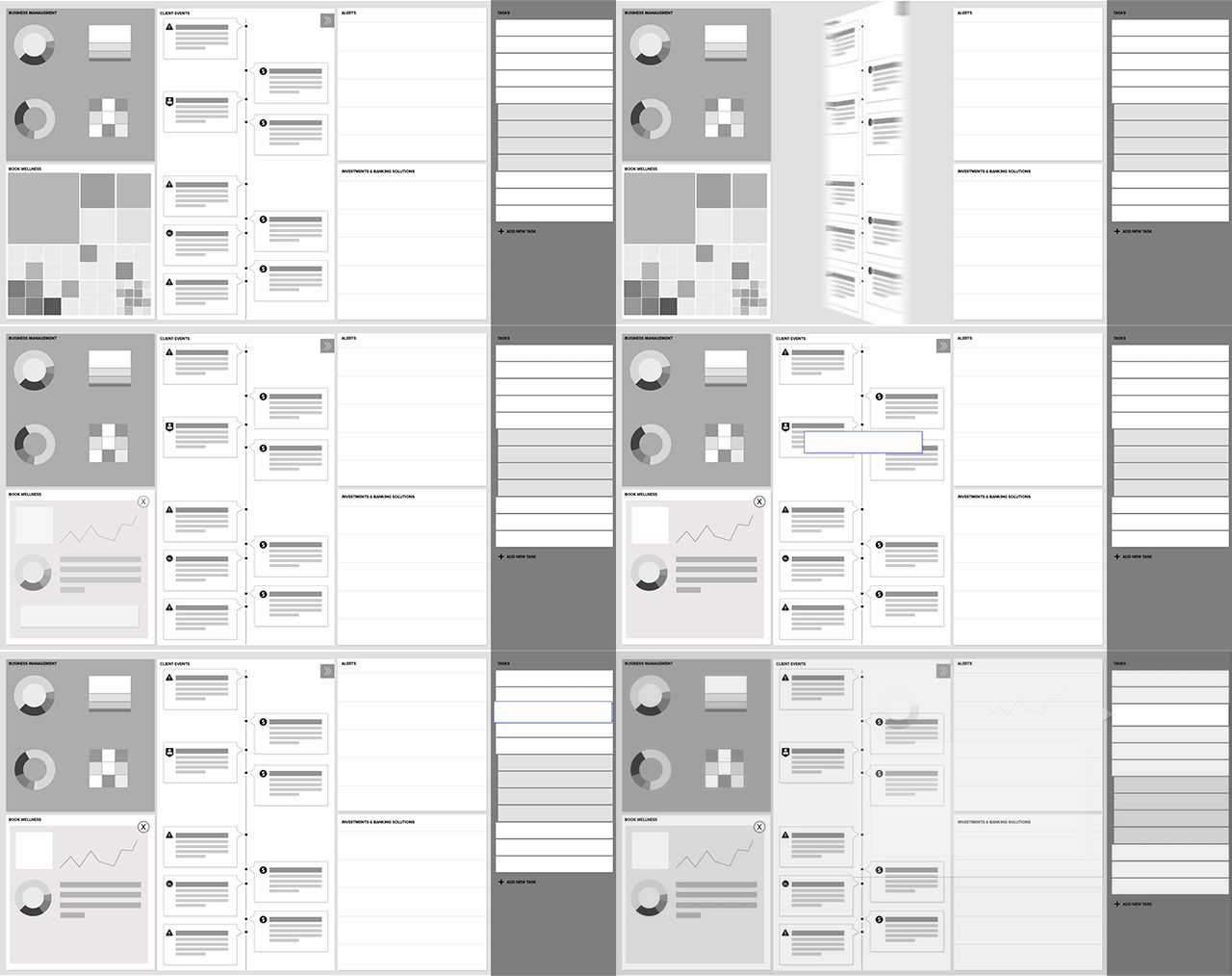
The expectation on UX is much higher than it has ever been. People want their information instantaneous, no matter how complicated the information or the accompanying graphics may be. This is why having something in place to allow your visitors the chance to find focus right away is a good idea.
How to put skeleton screens into action
As mentioned above, the skeleton screen is going to resemble the outline of your page.
Take a look at the page and break it down bit by bit. You can look at the overall layout of the screen as a shell.
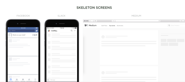
Take in the important graphics that are not going to change no matter what is going on in the middle of the screen. These static graphics or tools should be the first things to show up. It will give the mind the impression of the framework for the site. It also establishes that these are things that are not going to move while the site is being used.
The next step is to create the body of the site itself.
If it helps, you can squint at the page and imagine the general outlines of the bodies of text, images and more. The idea at this point is to create a screen that mirrors what this looks like.
For better UX, you want for it to appear as if the words and images are emerging from the shadows rather than just appearing out of thin air. People looking for text will immediately gravitate towards that section.
Those looking to enjoy the pictures will start looking that section instead. Regardless of where focus will be, you’re giving the brain a chance to start focusing in on the screen itself.
When fully defined, some of the anchor images may give way to more finite images as well. The brain may not perceive that any of this is happening, but it accomplishes the goal of apparent instantaneous uploads.
As you build your skeleton screens, you may want to test them to see how they are working. If it seems as if you can tell that it is happening, your placeholder images may be slightly off from what the finished product is. You should take the time to tweak the images to assure that the mental trick is complete and that you’re providing the best possible UX to your visitors.
How the appearance of speed enhances UX
You are doing two things when you provide your visitors with an apparent faster load time.
The first thing you’re doing is you’re giving the illusion that your technology is faster than what it actually is. This makes you more reliable and a go to when it comes to relying on your for services.
Everyone is looking for the most powerful phones and computers with the fastest Internet connections. If they feel that they have the latest devices but your site is not coming up instantaneously on their new device, they will distrust your ability to be there when they need you and they will go on to the next site that actually can give them what they want.
The appearance of speed also helps you to enhance UX, because the visitors themselves feel as if they are getting more done. Anyone who jumps to another site because the load time was too long do so because they feel as if they are wasting time.
Since time is valuable, they don’t want to waste time. Even if the site you run is designed as a gaming site, it is not a good idea to remind people that they are wasting time. This is a surefire way to have visitors leave the site and never come back again.
What we learned
The biggest thing we learned is that even though progress bars and spinners work to appease people, they also let people know that they are being appeased. They are looking at an image to provide information that something is happening.
However, when you use skeleton screens, people don’t have the perception that something is anything other than instantaneous on their screen. The eyes don’t understand that they were looking at one thing and that the images and text emerged there. Instead, they have the perception that the screen came up instantaneous.
Rather than hoping that you can appease your visitors, you can have the assurance that your visitors are actually happy. After all, happiness will bring people back. Happiness is what good UX is all about. If skeleton screens can produce happiness in your visitors then you have done your job. I know I would like to visit your site and have the feeling of an instantaneous download!

Leave a Reply