What Is Cyberchimps Responsive Theme? – Is It Ideal For you?
Are you looking for a full fledged review of the Cyberchimps Responsive theme?
As of today, WordPress hosts over 50000 themes. However, it’s not something where you should choose just another option. A theme is the fundamental building block for any WordPress website, and choosing the wrong one can have several drawbacks.
Responsive theme is one of the most preferred theme options that users generally consider. However, to determine if it’s worth using, I tried the theme and explored all of its features.
I have summarized my experience in this review article, which you should consider before using the theme.
- Background of Responsive Theme
- 1. Customization Features of Responsive Theme
- Presets Option
- Header and Footer Builder
- Posts Page Setup
- Real Time Customization Preview
- Responsive Theme Performance
- To understand the performance of the Responsive theme better, I used the theme and ran a PSI test to check the core web vitals. The results of the same are as follows:Extended Functionalities of Responsive Theme
- Responsiveness
- SEO Factors
- Support and Updates
- Responsive Theme Pricing
- FAQ
- Wrapping Up
Cyberchimps Responsive is the Best WordPress Theme – Get it for free!
Background of Responsive Theme
Responsive is a free WordPress theme developed by the team behind Cyberchimps. Introduced in 2011, the Responsive theme was the initial product launched and gained significant popularity after its release.
Since then, it has continued to evolve within the dynamic WordPress environment, further enhancing its features. In addition to regular bug fixes, improvements, and feature launches within the theme, the team has also introduced various new tools as plugins, namely:
- Responsive Plus – Starter Templates
- Responsive Addons for Elementor (RAE)
- Responsive Blocks
Each of these plugins offers unique functionalities to users, and although they can function independently, they provide additional benefits when used with the Responsive theme.
Alongside the use of the theme, I also had the opportunity to utilize these plugins and have shared my experience in this guide.
Coming back to the theme, it boasts an active installation of over 20,000 and is rated 4.7/5 on WordPress.org and 4.6/5 on Trustpilot.
Factors Considered to Review The Theme
Now that we begin with the central part of the review, here are the major factors I considered to conclude whether the theme is worth using or not.
- Customization Features
- Performance
- Responsiveness
- SEO Aspects
- Support and Updates
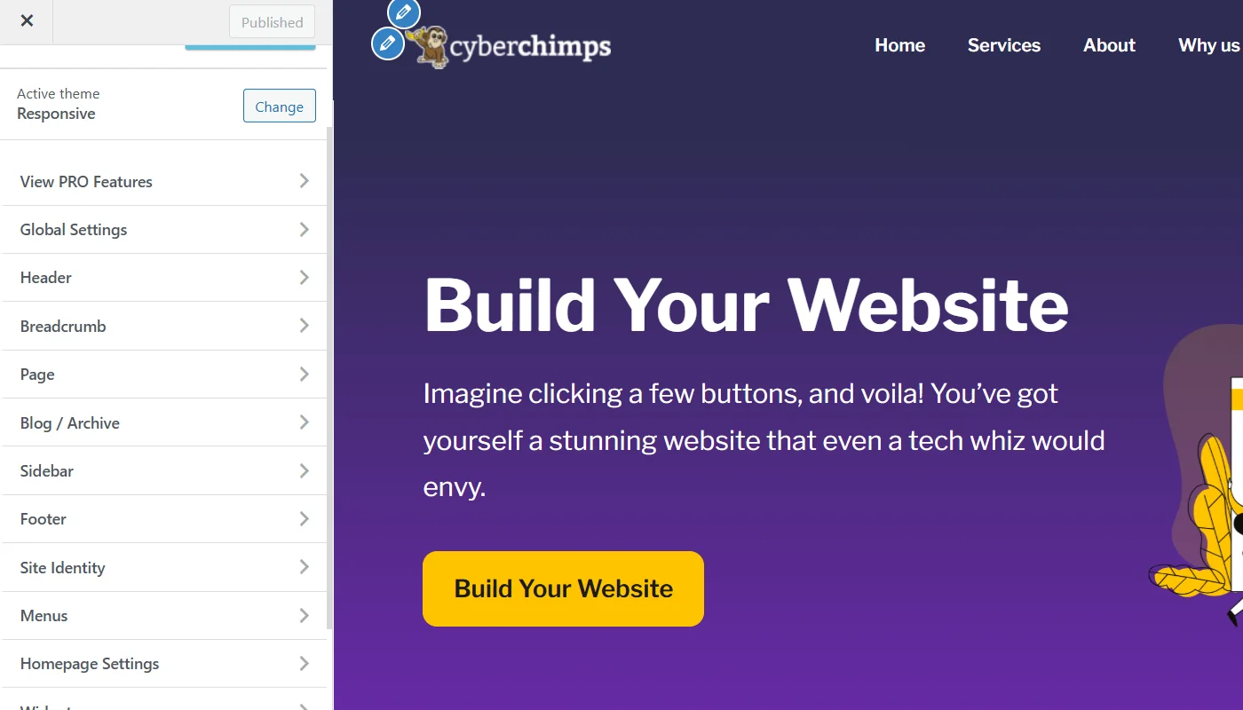
1. Customization Features of Responsive Theme
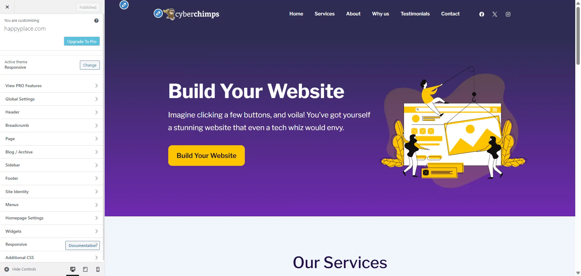
The customizer settings of the Responsive theme are robust and offer a range of versatile options. If you have explored other WordPress themes, you might see that the customizer boasts most of the standard customizer options, like:
- Global customizer to set up site layout, buttons, form fields, colors, backgrounds, typography, social links, and embed scripts.
- Create and set up breadcrumb and menu navigation.
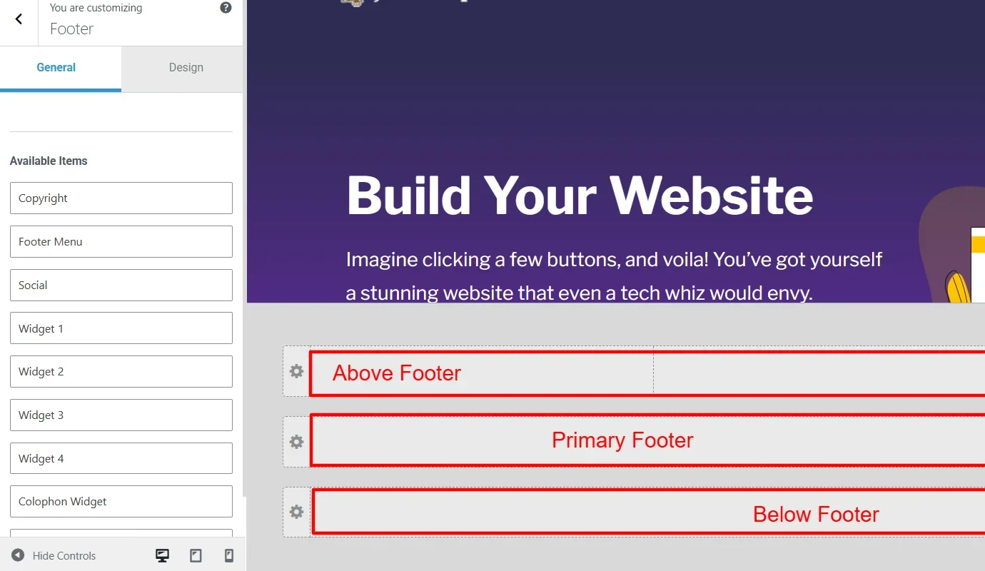
- Header builder and footer builder
- Site identity setup
- Home page and post page set up
Apart from these, the Responsive theme also features some unique customizations.
Presets Option
Presets in WordPress are a predefined set of styles or customizations that can be applied to a particular element or section of a website with a single click, including typography, color schemes, spacing, or design elements.
You can think of them as filters in image editing. Applying a filter to a picture automatically adjusts various settings, such as contrast, brightness, and saturation.
This preset feature in the Responsive theme is available within the global customizer settings.
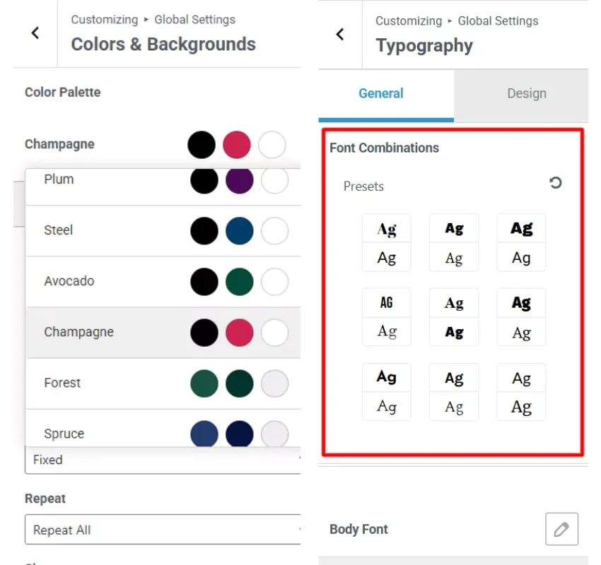
It offers both font and color presets. These presets, when applied to your site, adjust the overall background color of each element and the font typography of each header, from h1 to h6, within the site.
Additionally, if you prefer to apply a color to the font on one or more elements, you can manually customize them.
Header and Footer Builder
The header and footer builder is common in popular classic themes.
Responsive theme offers them at no cost. However, you need the premium versions for most other WordPress themes.
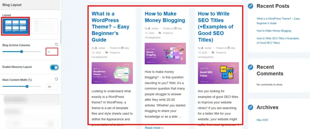
Posts Page Setup
Similar to the header and footer builder, the posts page setup is also a standard feature common to all classic WordPress themes. However, the Responsive theme additionally offers some extra features that most of them do not provide.
These customizations include:
- Adding up to six posts in each row.
- Setting up a masonry layout
- Specific customization for the appearance of each post to arrange the heading, content, meta, and others.
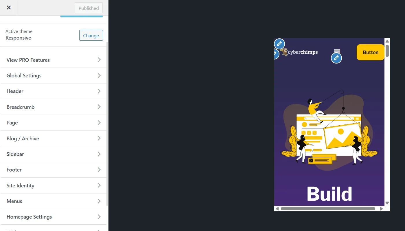
Real Time Customization Preview
Alongside all other customization features, the Responsive theme also offers a real-time customization preview, allowing you to track your customizations in real-time.

This not only makes the theme more intuitive and easy to use but also helps users understand customization features in detail.
Responsive Theme Performance
Along with features, website performance also plays a crucial role. It is worthless, no matter the number of features you give, if it affects the performance or slows down your site.
Google has consistently penalized slow websites in its past updates, and a common issue for most websites is often attributed to the theme. The core of the theme determines the theme’s performance.
It is recommended that you try any theme on a staging site before using it on your live website.
To understand the performance of the Responsive theme better, I used the theme and ran a PSI test to check the core web vitals. The results of the same are as follows:Extended Functionalities of Responsive Theme
As mentioned in the article earlier, apart from the extensive customization options, the Responsive Theme also offers additional functionalities when used in conjunction with its sister plugins.
Responsive Plus – Starter Templates
As it is clear from the plugin’s name, the Responsive Plus – Starter Templates plugin offers 250+ ready-to-use starter templates that you can import with a single click. These templates are either built with Elementor page builder or Gutenberg Block Editor.
For users focused on Elementor, you get more than 100 templates to create a website in just 5 minutes.
Once you have imported an Elementor template, all you need to do is customize the template according to your brand’s needs and style. Once done, you can publish the template as a website.
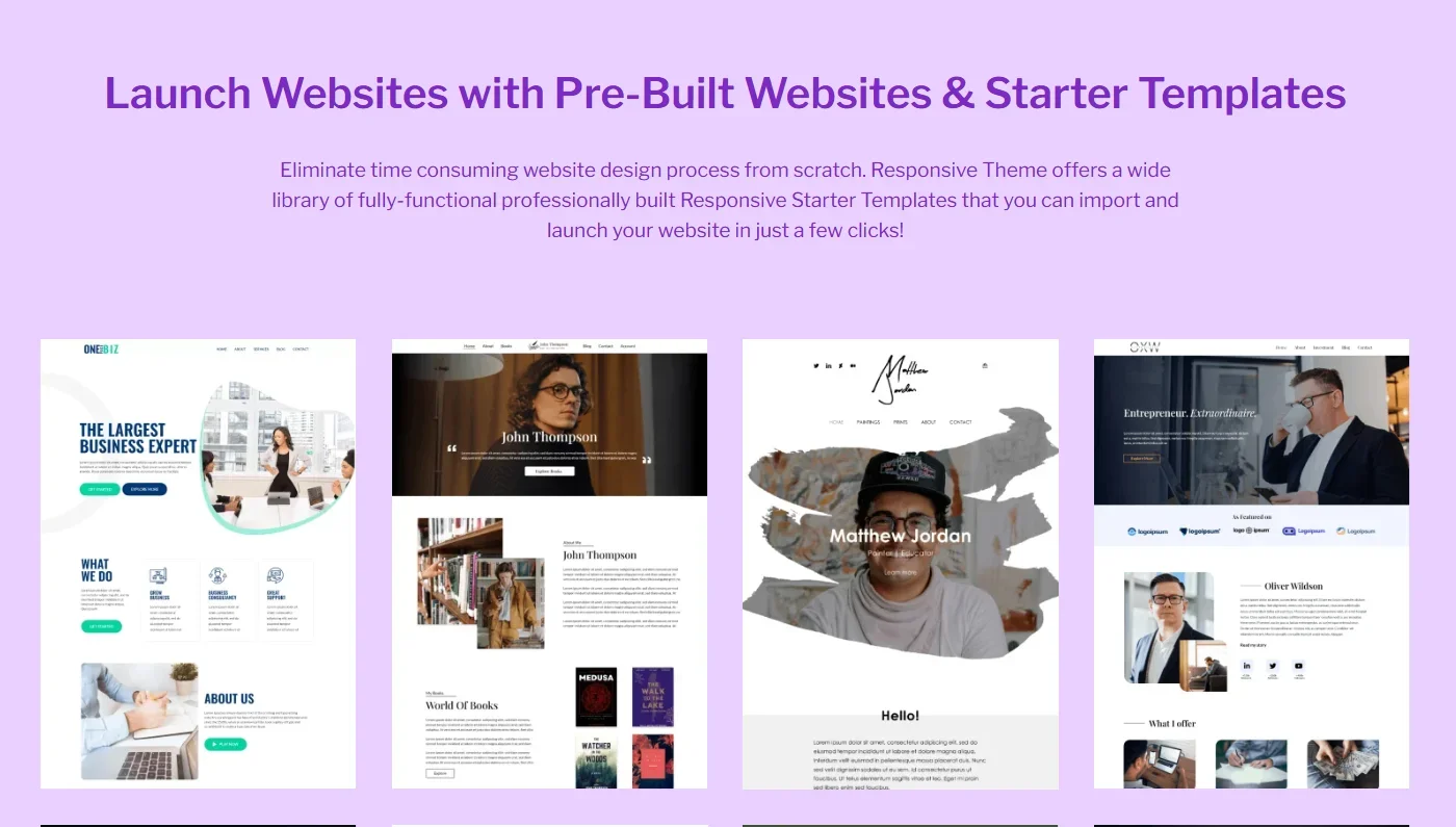
The plugin works independently, allowing users to use the templates with any theme. However, when used with the Responsive theme, it offers advanced features that would otherwise require a separate plugin for each.
These features include:
- Building a fully fledged mega menu. This feature helps websites with numerous pages and content to be organized in an expanded drop-down menu.
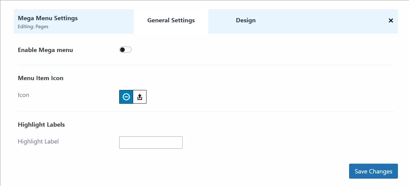
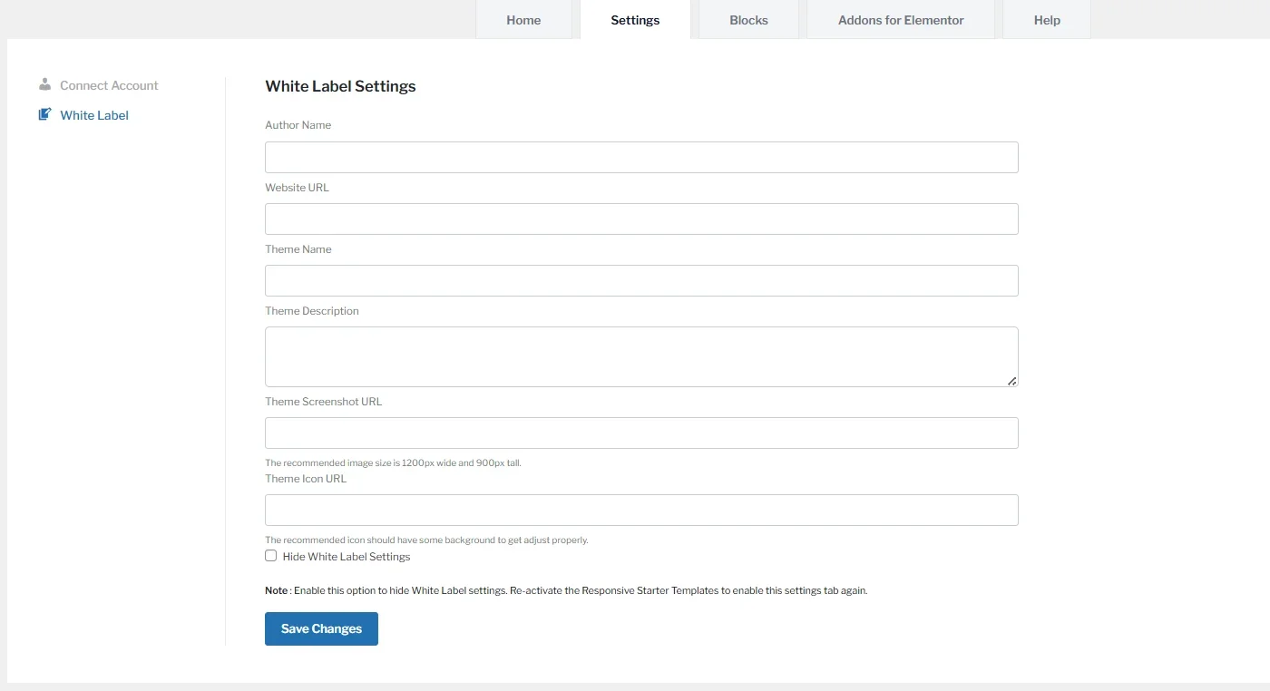
- White-labeling the Responsive theme. As of today, brands prefer their personalization and branding on their work. This feature enables them to rebrand the Responsive theme with their name.
So, if you are someone looking to sell a theme as your own, you can choose the white labeling option that Responsive theme offers and provide the details about your brand.
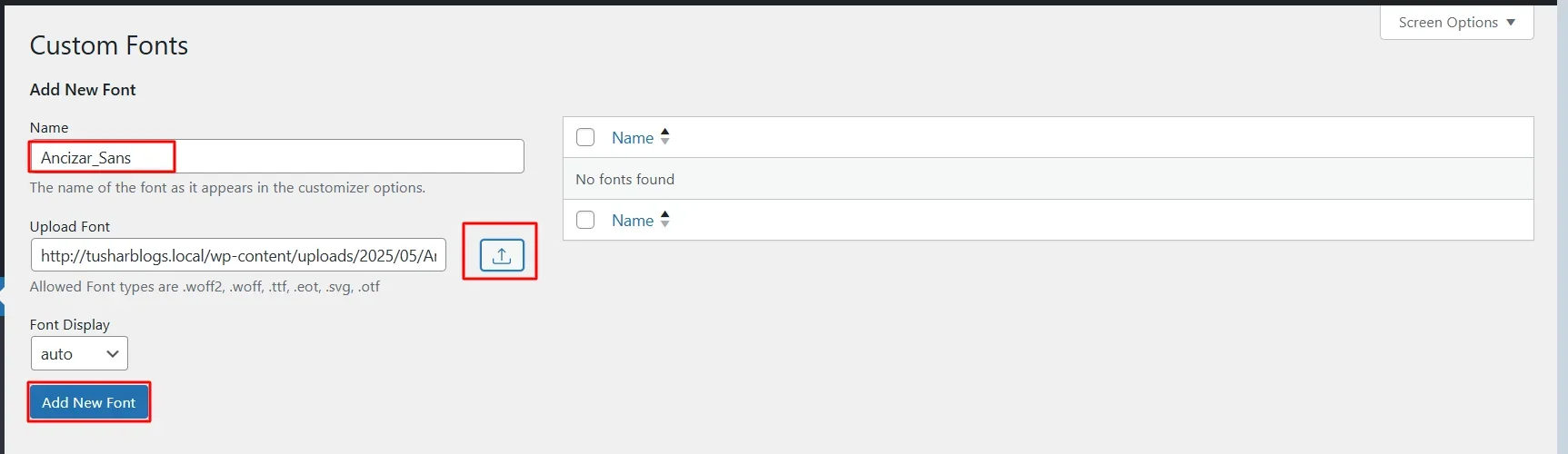
- For users who prefer custom font designs, the Responsive theme offers integration with custom fonts. This allows users to upload and apply external font libraries to their website.
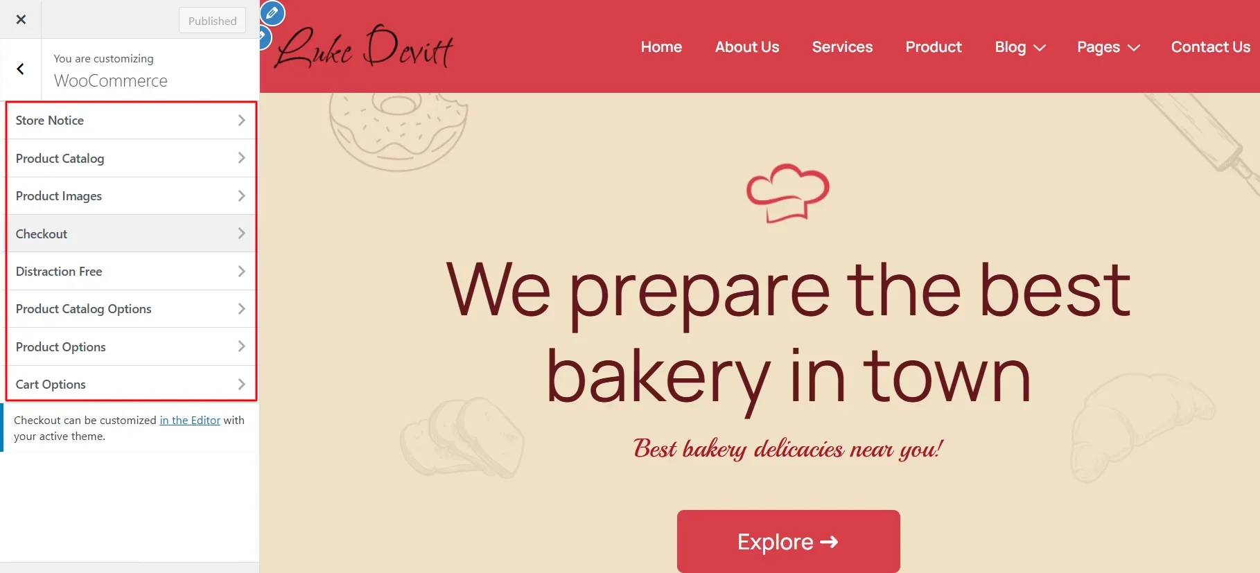
- Enhanced WooCommerce options – WooCommerce has emerged as a go-to tool for all WordPress users who want to build an e-commerce website, contributing a significant portion of overall WordPress sites. When the Responsive Plus plugin is combined with the theme, it provides users with additional features to enhance the WooCommerce tools.
Apart from the Responsive Plus plugin, the theme also offers two other popular plugins that help build websites either with Elementor or Gutenberg.
Responsive Addons for Elementor
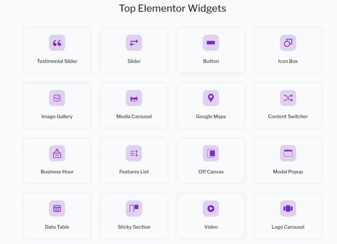
Responsive Addons for Elementor or RAE is a plugin designed for users who use the Elementor page builder to build their websites.
It offers users a library of over 80 advanced Elementor widgets that help you add features and functionality to your Elementor-built website.
Responsive Blocks
Responsive Blocks is another plugin developed by Cyberchimps for users who are looking to build their websites using Gutenberg blocks.
The plugin offers over 50 Gutenberg blocks that users can use to add versatile features and functionalities to their site.
Moreover, similar to RAE widgets, these blocks are also fully customizable and can be tailored to meet specific requirements.
Now that we’ve covered the various features and functionalities of the Responsive theme, let’s dive ito its performance and other parameters.
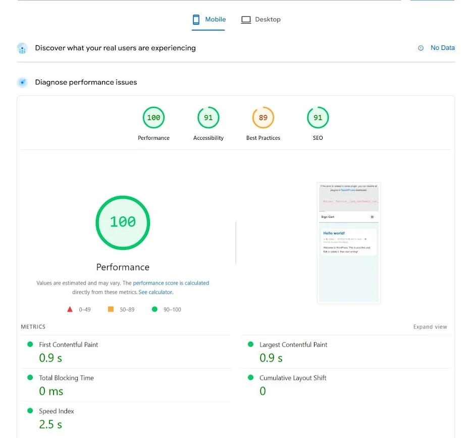
The overall core web vitals of the website appear promising, with amazing metrics of core web vitals. However, the score is dynamic and may change based on your usage. Therefore, you should also test it before using it on your site.
Responsiveness
Cyberchimps has named its theme ‘Responsive’ for a reason. To verify this, I thoroughly tested customizing the website and its frontend appearance on both desktop and mobile devices.
The desktop customization appeared really smooth, with convenient settings and changes that were quick and available in real-time.
On the other hand, the mobile device’s responsiveness also appeared quite decent. However, I found its customization quite complex, as most elements by default appeared the same size as they did on desktop, which looked huge for mobile screens.
SEO Factors
The role of SEO on the website determines the overall ranking of your website on search engines.
No matter how good a theme you use or how many features it offers, if it prevents your website from ranking, all your efforts will go down the drain. While a general myth has been developed that SEO is dependent on content, that’s just a partial truth. SEO of a website is also determined by the theme’s build and technical factors.
To generally ensure the SEO friendliness of the theme, I prefer to check the code quality and structure of the theme, as well as its SEO compatibility with other tools and page loading size.
While the code used to build the product plugin is not directly mentioned accessible on the Cyberchimps website, you can directly raise a ticket to ask their team.
Upon the same inquiry, I learned that the theme utilizes coding libraries such as React, JavaScript, HTML, CSS, jQuery, Backbone.js, Babel, Webpack, Sass, and PHP to build its site. These are considered among standard libraries to build themes these days, meeting the requirements of general users.

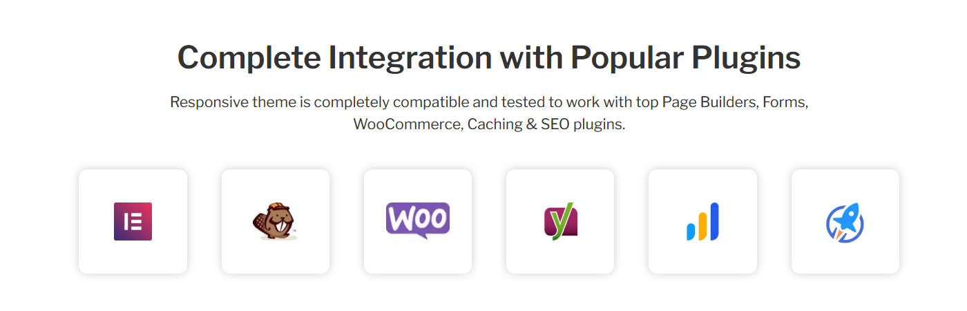
In terms of compatibility, I tried various SEO plugins and themes that were smoothly integrated with each other. Moreover, the theme is also compatible with other required plugins for website building.
Support and Updates

Cyberchimps offers 24/7 support. That is what is mentioned on their website. To check, I raised a ticket to understand one of their feature. To my surprise, I got a reply from their team in less than 2 hours and got all my queries solved. Hats off to the Cyberchimps support team.
You can raise a ticket or email [email protected] directly.
In addition to ticketing assistance, the team has also curated thorough documentation and video tutorials to understand how to use each feature.
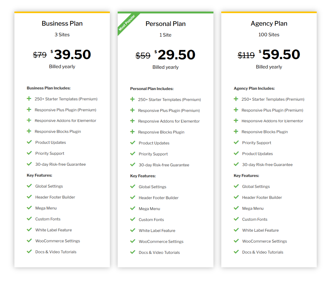
Responsive Theme Pricing
The Rresponsive theme is essentially free, with all of its features and customization possibilities available at no cost.
However, Cyberchimps provides the Responsive theme, as well as the three plugins described previously, as part of the Cyberchimps Responsive Platform, which serves as a complete website development toolbox.
If you want access to all their products, including the Premium templates they offer, you will have to purchase one of their plans, which starts as low as $ 29.50. Try the Cyberchimps Responsive Platform now and create your own stunning website today!
FAQ
1. Is the Cyberchimps Responsive theme Better Than Astra?
The best theme choice between Cyberchimps and Astra depends on your specific needs. Responsive is free, simpler, and more beginner-friendly with the most essential features, while Astra offers similar customizations and speed options, but only in its premium version.
2. Is Cyberchimps Responsive Theme Fast?
Yes, the Responsive theme is lightweight and performs well on speed tests and loads within 100kb.
3. Who Owns Responsive Theme?
The Responsive theme is developed and maintained by Cyberchimps, a business known for developing fast WordPress themes and plugins.
4. Can I Use Cyberchimps Responsive Theme Without Elementor?
Yes, you can use the Responsive theme without Elementor. It supports Gutenberg and works well with standard WordPress features.
5. Is the Cyberchimps Responsive Theme SEO-friendly?
Yes, the Responsive theme is built using clean code and modern frameworks, supports SEO plugins, and is optimized for speed, all of which contribute to better SEO performance.
Wrapping Up
Based on my experience with the Responsive theme and its sister tools, I found the tool to be really helpful, meeting most website-building standards.
Additionally, the theme is free. However, its features are among the ones offered by most other premium themes.
In my opinion, you should consider the theme while building your website and assess its potential yourself.
Moreover, if you liked the article, you can also consider reading:
Leave a Reply