8 Rules for Choosing Your Website Background Patterns

Everyone with their own website knows the challenge of choosing the right website background patterns, colors, and fonts. One mistake can cost many clicks and visitors, and nobody wants that to happen. If you decide to develop your own website, you should follow some simple rules, so you can make the design to be more effective and more user-friendly.

That is the only way to gain more clicks and visitors because the people are consuming the things first visual and then by the content. It is the same case about websites – the good looking website will keep your visitors longer and you can be sure that they will come back again or recommend your site to their friends or on the social media.
As long as you keep the design simple and effective, you are doing it right.
The fonts and colors you are using are important but never underestimate the importance of the right chosen background patterns for websites.
You also need to be sure that the website background is responsive, as your site, for every device available (personal computer, mobile phone or tablet).
If you are good with web design programming languages, you can make your own, customized website background patterns, to give some unique touch to your website. You can also choose professionals from websharx for creating the same.

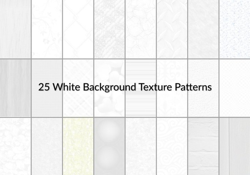
But, you do not have to worry if you are not so good with web-design because there are thousands of wallpapers available on the Internet. You can buy full packs of themed website background patterns for a very low price or you can download them for free.
There are only four colors that you must remember: dark blue, white, grey and black. Those are the most effective colors for websites. Try to remember the colors of the most popular websites and you will see that most of them have these colors (or their combinations) in their designs.

Also, you need to be careful with your choices. They should be compatible with the content of your website. If you own corporate website, you should use the corporate colors and fonts to create the best design, including the background.
The background structure of the website has two parts – body background and content background. The body background is usually some carefully chosen website background pattern or other graphical images.
The most neutral pattern choice is the single color with a gradient of tones, but don’t be afraid to use bold and vibrant combinations for the body background – flowers, dots, abstract forms or even high-resolution photographs. The content background has to be more neutral.
Choose a single colour design or some discreet pattern with tiny forms. Also, you can use transparent textures for the content background that smooth the body pattern, so the text is easy to read.
Choosing the right website background patterns

1. Colors – Choosing the right color scheme can be a very courageous and risky step, either for the web-design beginners and professionals. The result has to be harmonious and the colors should be complementary. First, you need to choose the dominant color and then to add other colors to the scheme. Every color has a different emotional response and you should choose it carefully.

Think about what feelings your visitors need to have while reading your website and there is the answer to what color you need to use.
For example, green represents health, herbs, nature and ecology. Yellow represents youth and cheerfulness.
Red represents love, passion, and excitement. Blue represents calmness, trust, and security. Gray represents luxury and simplicity. Black represents elegance, power, and sophistication.
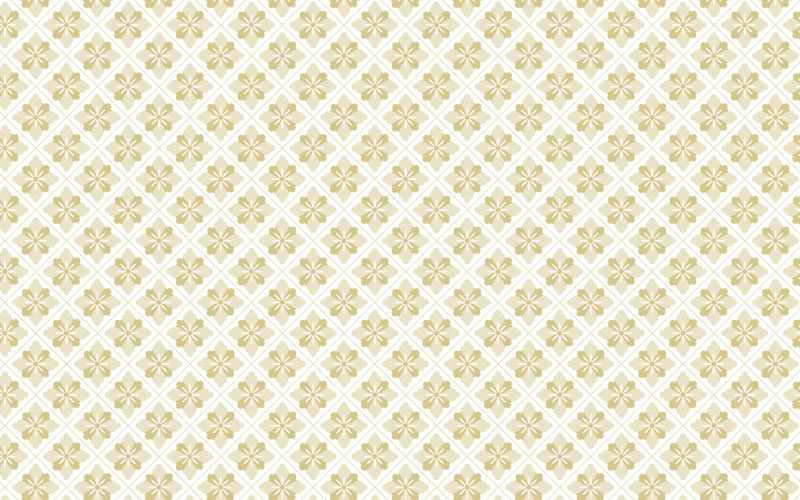
2. Choosing background patterns for websites – It is for you to choose if you will use plain color background or some pattern or texture, but you should think about it like you need to paint the walls in your house.
Your website should be comfortable for the visitors as same as your living room for your guests. You have many available free vector background patterns on the Internet and you can choose the right one for you and your website.
3. Use a natural combination of colors – White goes great with every neutral color. Don’t use bright and fluorescent colors or if you have to, combine them right with the achromatic specter. You don’t want to cause dizziness to your visitors, right?
Related: Psychology of colors
4. The contrast between the background and the content should be strong – The best combination is black text on white background, but that is very boring. The basic rule is that the background should be bright and the text dark and bold, so it can be readable to the visitors.
5. Choose 3-5 colors for your design – one is the basic and others are additional. The visitor’s experience should be pleasant and using more than 5 colors can confuse their eyes and they may skip important parts of your site.
6. For eCommerce sites, you need to keep it simple – Use combinations of black, white and discreet blue, yellow or green, because the focus needs to be on the content.
Related: 7 Ways to increase traffic on your e-commerce site
7. For corporate sites use the corporate colors – The only purpose of these sites is to promote the brand. The colors are tied to brand recognition and awareness, so you need to use corporate colors carefully and with a lot of taste. That is the only way to keep visitors on the site even though these types of sites can be the most boring on the Internet.
8. Stylish websites – This type of websites are for galleries, restaurants, fashion ateliers or creative industries. You can play with the patterns, textures, and colors. Also, you can choose some of the DealFuel’s wallpaper packs, for example, the pack of 14 Marble painted backgrounds and many other available on the Internet. In this case, free vector background patterns for websites should be creative, impressive and inspirational, but the basic rule is the same – the content should be easy to read. You should never use backgrounds with similar color to the text’s color.
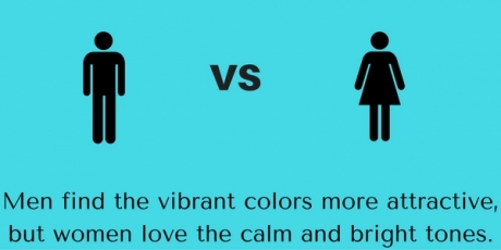
People of different age or gender react differently to the colors. Old people find simple sites more attractive. Young people like vibrant colors.
Males love the tones of blue and orange. Women prefer red and yellow. Men find the vibrant colors more attractive, but women love the calm and bright tones.
Also, the nations and origins play a big role in color preferences. Western cultures prefer white, while Japanese love pink that reminds them of sakura flowers. USA uses the green color for finance-themed sites because it reminds them of their money – dollars.
You should define the purpose and the target of your website and after that, you will be able to choose free vector background patterns for websites. Patterns and textures are important, but the color and color combinations can make your site effective and visibly beautiful for the users.
Most used colors for website backgrounds 
- Brown – comfort, stability, and strength. You can use this color if you own a site for a coffee shop or agricultural items, also for personal blogs and diaries.
- Yellow – joy, optimism, and happiness. This color is great if you need to sell something through the site or to share some great message with the visitors.
- Violet – wisdom, mystery, and sophistication. Also great for personal blogs or mysterious content.
- Black – elegance, sophistication, and power. The best choice for eCommerce sites that need to be serious and powerful.
- Gray – security, simplicity, and maturity. Use the grey-scale for your daily news on your site.
- Pink – love and romance. Enough said.
- Red – passion, danger, energy and power. A simple and effective choice for erotic blogs and content.
- Blue – patience, freedom, coolness, and peace. Blue is the most used color on social media sites.
- Green – ecology, life, nature, health, and wealth. Everything is better with green.
- Orange – courage, playfulness, and warmth. Good for fashion blogs.

Remember, these are only our ideas and you should use your creativity to make the right combination of colors for your website. You can use a few tones of the same color or you can choose 3-4 complimentary colors for your site scheme.
Just think about the message you want to pass to your readers and the job is half done. The combination of the right colors and patterns can make a big difference between your site and many others on the Internet. Your site shouldn’t look that the backgrounds and fonts are randomly chosen.
Additional Reading: Top typography trends of 2016
You can find many available tools on the Internet and use them to create your own website background patterns and color schemes. Playing with colors and tones can be very fun if you know to do it in the right way.
You should remember that the choice of the background of your site is not a naïve task – it may represent the whole brand you are trying to build through the website. You should be careful about the background resolution because the low-quality website background patterns can make your site look cheap, blurry and unattractive.
This is one of the main reasons why you should choose free vector website background patterns for your site. If you want an even greater challenge, you can choose video or free vector background patterns for your site, but you shouldn’t do it if this is your first website project. The website background patterns can be the personal mark of your site project. If you can’t choose between many available designs, textures, and patterns, you can always go with simple and plain backgrounds and you can change it later.
The choice of color schemes shouldn’t be based on your personal favourite colors and shapes. The good taste, style and elegance are in the first place, as same as the user’s experience. You shouldn’t pick the colors randomly. Think smart and think about the audience. The colors mustn’t overpower the content of the website.
Wrapping up, website background patterns influence your website in many ways. But it is not rocket science to get the one that works for you. With the right choice of colors, fonts, backgrounds and menus, you can develop a very successful and very effective website that will bring more clicks for more income. Good Luck.
Leave a Reply